
CSS Modules, styled-components, and Tailwind
So far in this React learning journey, we’ve built the logic of an Order Management System (OMS):
- Routing orders → https://thedevlearnings.com/react-router-v6-nested-routes-and-guards/
- Managing global state → https://thedevlearnings.com/redux-toolkit-best-practices/
- Forms and validation → https://thedevlearnings.com/validation-with-formik-react-hook-form/
- Performance optimization → https://thedevlearnings.com/react-memo-usecallback-for-smoother-apps/
But now we reach a very practical question every developer eventually asks:
How should we style a real production React application?
In a real OMS dashboard:
- Warehouse users scan items quickly
- Customer support checks shipment status
- Managers monitor orders on big screens
If styling is messy → UI breaks → productivity drops → business suffers.
Today we’ll learn 3 modern React styling approaches by building the same OMS UI using:
- CSS Modules (structured & predictable)
- styled-components (dynamic & component-driven)
- Tailwind CSS (fast & utility-first)
We will build this UI in all three:
Order Dashboard → Order Card → Status Badge (Pending / Packed / Shipped / Cancelled)
And every example is copy-paste runnable locally.
Project Setup (Common for All)
Create project:
npx create-react-app oms-styling-demo
cd oms-styling-demo
npm start
Clean src/ folder and replace with following structure:
src/
  App.js
  data/orders.js
  components/
src/data/orders.js
const orders = [
  { id: 1001, customer: "Rahul Sharma", total: 2499, status: "PENDING" },
  { id: 1002, customer: "Neha Verma", total: 5999, status: "PACKED" },
  { id: 1003, customer: "Arjun Patel", total: 1299, status: "SHIPPED" },
  { id: 1004, customer: "Megha Singh", total: 899, status: "CANCELLED" }
];

export default orders;
src/App.js
import React from "react";
import orders from "./data/orders";
import OrderList from "./components/OrderList";

function App() {
  return (
    <div>
      <h1 style={{ textAlign: "center" }}>OMS Dashboard</h1>
      <OrderList orders={orders} />
    </div>
  );
}

export default App;
Now let’s implement styling approaches one by one.
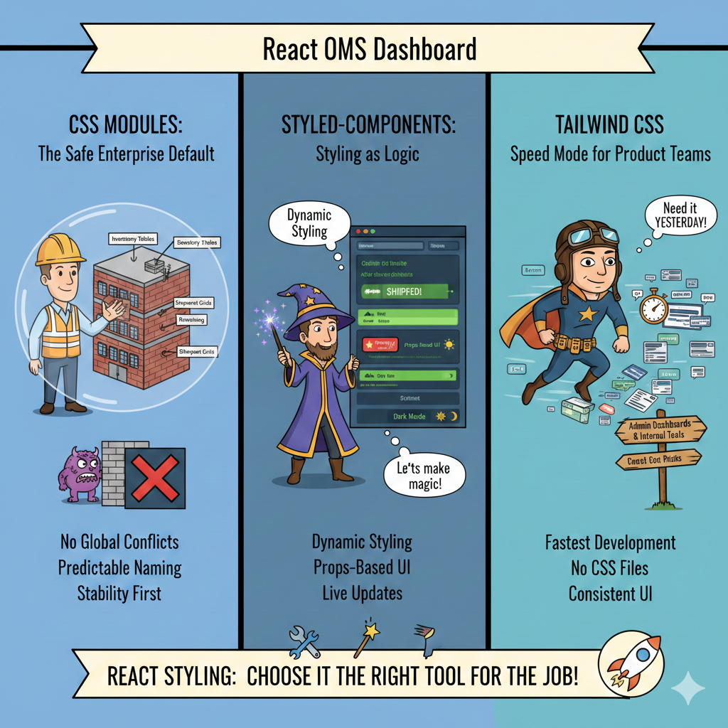
CSS Modules — The “Safe Enterprise Default”
Why CSS Modules exist
In big OMS applications, global CSS causes disasters:
.status { color: red }Now suddenly:
- Order page breaks
- Shipment page breaks
- Inventory page breaks
Because CSS is global by default.
CSS Modules fix this by making styles scoped automatically.
Folder Structure
src/
  components/
    OrderList.js
    OrderCard.js
    StatusBadge.js
    OrderCard.module.css
    StatusBadge.module.css
components/StatusBadge.module.css
.badge {
  padding: 6px 10px;
  border-radius: 6px;
  color: white;
  font-weight: bold;
  font-size: 12px;
}

.PENDING {
  background-color: orange;
}

.PACKED {
  background-color: blue;
}

.SHIPPED {
  background-color: green;
}

.CANCELLED {
  background-color: red;
}
components/StatusBadge.js
import React from "react";
import styles from "./StatusBadge.module.css";

function StatusBadge({ status }) {
  return (
    <span className={`${styles.badge} ${styles[status]}`}>
      {status}
    </span>
  );
}

export default StatusBadge;
components/OrderCard.module.css
.card {
  border: 1px solid #ddd;
  padding: 16px;
  border-radius: 10px;
  margin: 10px;
  background: #fafafa;
  transition: 0.2s ease;
}

.card:hover {
  box-shadow: 0 4px 12px rgba(0,0,0,0.1);
}

.customer {
  font-size: 18px;
  font-weight: bold;
}

.total {
  color: #444;
  margin-top: 6px;
}
components/OrderCard.js
import React from "react";
import styles from "./OrderCard.module.css";
import StatusBadge from "./StatusBadge";

function OrderCard({ order }) {
  return (
    <div className={styles.card}>
      <div className={styles.customer}>{order.customer}</div>
      <div>Order ID: {order.id}</div>
      <div className={styles.total}>₹ {order.total}</div>
      <StatusBadge status={order.status} />
    </div>
  );
}

export default OrderCard;
components/OrderList.js
import React from "react";
import OrderCard from "./OrderCard";

function OrderList({ orders }) {
  return (
    <div style={{ display: "flex", flexWrap: "wrap" }}>
      {orders.map(order => (
        <OrderCard key={order.id} order={order} />
      ))}
    </div>
  );
}

export default OrderList;
What We Learned
CSS Modules give:
✔ No global conflicts
✔ Predictable naming
✔ Great for enterprise apps
❌ Harder dynamic styling
In OMS systems, this works best for:
- Inventory tables
- Shipment grids
- Warehouse panels
styled-components — Styling as Logic
Now imagine:
An order becomes SHIPPED → animate → flash green → highlight row
CSS alone struggles here.
Enter styled-components.
Install
npm install styled-componentsNew Folder
src/
  styled/
    StyledOrderCard.js
    StyledStatusBadge.js
    StyledOrderList.js
styled/StyledStatusBadge.js
import styled from "styled-components";

const colors = {
  PENDING: "orange",
  PACKED: "blue",
  SHIPPED: "green",
  CANCELLED: "red"
};

const StyledStatusBadge = styled.span`
  padding: 6px 10px;
  border-radius: 6px;
  color: white;
  font-weight: bold;
  font-size: 12px;
  background-color: ${props => colors[props.status]};
`;

export default StyledStatusBadge;
styled/StyledOrderCard.js
import styled from "styled-components";

const StyledOrderCard = styled.div`
  border: 1px solid #ddd;
  padding: 16px;
  border-radius: 10px;
  margin: 10px;
  background: #fafafa;
  transition: 0.3s;

  &:hover {
    transform: translateY(-4px);
    box-shadow: 0 6px 14px rgba(0,0,0,0.15);
  }
`;

export default StyledOrderCard;
styled/StyledOrderList.js
import styled from "styled-components";

const StyledOrderList = styled.div`
  display: flex;
  flex-wrap: wrap;
`;

export default StyledOrderList;
Update App.js
Replace contents:
import React from "react";
import orders from "./data/orders";
import StyledOrderCard from "./styled/StyledOrderCard";
import StyledStatusBadge from "./styled/StyledStatusBadge";
import StyledOrderList from "./styled/StyledOrderList";

function App() {
  return (
    <div>
      <h1 style={{ textAlign: "center" }}>OMS Dashboard (styled-components)</h1>

      <StyledOrderList>
        {orders.map(order => (
          <StyledOrderCard key={order.id}>
            <div><b>{order.customer}</b></div>
            <div>Order ID: {order.id}</div>
            <div>₹ {order.total}</div>
            <StyledStatusBadge status={order.status}>
              {order.status}
            </StyledStatusBadge>
          </StyledOrderCard>
        ))}
      </StyledOrderList>
    </div>
  );
}

export default App;
What We Learned
styled-components gives:
✔ Dynamic styling
✔ Props-based UI
✔ Perfect for real-time dashboards
Perfect OMS use cases:
- SLA breach highlight
- Live order flashing
- Dark mode switching
- Role-based UI themes
Tailwind CSS — Speed Mode for Product Teams
Imagine a startup launching OMS in 2 weeks.
They don’t want:
- CSS files
- Naming conventions
- Architecture decisions
They want speed.
That’s Tailwind.
Install Tailwind
npm install -D tailwindcss postcss autoprefixer
npx tailwindcss init -p
tailwind.config.js
export default {
  content: ["./src/**/*.{js,jsx,ts,tsx}"],
  theme: {
    extend: {},
  },
  plugins: [],
};
src/index.css
Replace everything:
@tailwind base;
@tailwind components;
@tailwind utilities;
Tailwind OMS UI
Replace App.js:
import React from "react";
import orders from "./data/orders";
import "./index.css";

const statusColors = {
  PENDING: "bg-yellow-500",
  PACKED: "bg-blue-500",
  SHIPPED: "bg-green-600",
  CANCELLED: "bg-red-500"
};

function App() {
  return (
    <div className="p-6">
      <h1 className="text-3xl font-bold text-center mb-6">
        OMS Dashboard (Tailwind)
      </h1>

      <div className="flex flex-wrap gap-4 justify-center">
        {orders.map(order => (
          <div
            key={order.id}
            className="border rounded-xl p-4 w-64 shadow hover:shadow-lg transition"
          >
            <div className="font-semibold text-lg">{order.customer}</div>
            <div className="text-gray-600">Order ID: {order.id}</div>
            <div className="mb-2">₹ {order.total}</div>

            <span
              className={`text-white text-xs px-2 py-1 rounded ${statusColors[order.status]}`}
            >
              {order.status}
            </span>
          </div>
        ))}
      </div>
    </div>
  );
}

export default App;
What We Learned
Tailwind gives:
✔ Fastest development
✔ No CSS files
✔ Consistent UI
Best OMS usage:
- Admin panels
- Internal tools
- Quick dashboards
Real-World Comparison
| Feature | CSS Modules | styled-components | Tailwind |
|---|---|---|---|
| Learning Curve | Easy | Medium | Easy |
| Dynamic UI | Poor | Excellent | Good |
| Speed | Medium | Medium | Very Fast |
| Enterprise Stability | Excellent | Good | Good |
| Theming | Hard | Excellent | Good |
| Best For | Large OMS | Live dashboards | Internal tools |
When Should YOU Use What?
Warehouse Operations Panel
Use → CSS Modules
Reason → stability > flexibility
Customer Support Console
Use → styled-components
Reason → dynamic highlights, priority orders
Admin Analytics Dashboard
Use → Tailwind
Reason → rapid iteration
Key Takeaway
React styling is not about which is best.
It’s about:
Which matches the business workflow
OMS UI is operational software — not a marketing website.
So:
- Stability matters
- Speed matters
- Clarity matters
Pick styling based on the team using the screen, not developer preference.
Recommended Reading From Previous Articles
Before moving forward, revise these:
State vs UI responsibility → https://thedevlearnings.com/local-state-vs-global-state-decision-framework-for-react-apps/
Reusable components → https://thedevlearnings.com/designing-reusable-component-systems-2/
Performance optimization → https://thedevlearnings.com/usememo-in-complex-ui-scenarios/
Routing dashboards → https://thedevlearnings.com/dynamic-routing-and-code-splitting/
These concepts directly affect styling decisions.
Final Thoughts
By now you should understand:
CSS Modules → predictable enterprise styling
styled-components → dynamic business logic styling
Tailwind → rapid UI delivery styling
A real OMS often uses all three together.
Yes — production systems rarely use just one.
👉 In the next article we will cover:
Best practices for dark mode and theming
This is where styling meets UX, accessibility, and real business productivity.
Member discussion